Excerpted from BrandChannel: “Brand Obama or Brand McCain ”, Patt Cottingham
* * * * *
Ken’s Note: The full article is interesting reading for marketers. It’s a non-political run-through of of how the candidates’ “brands” developed — the words, the images, and of course, the logos.
* * * * *
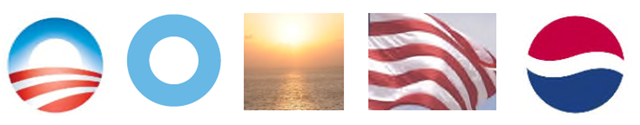
OBAMA LOGO: The Obama Campaign chose an icon that captured the feeling of sunrise over a field of red and white stripes. There is also a subtle “O” for Obama that is in play here though the name Obama is not used in the icon. This makes it a universal logo/icon that anyone can attach their own meaning to. The Obama and Pepsi (far right) logos are both round, youthful, and use the colors red, white, and blue.
* * * * *
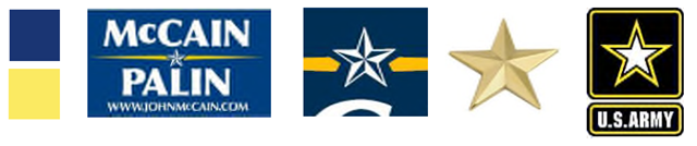
McCAIN LOGO: The McCain Campaign chose a logo that comes directly out of his family heritage of 3 generations in the US Navy, as well as his war hero status political leader. The colors of blue and gold are US Navy colors, the star icon comes directly out a military reference found on many uniforms indicating rank. The McCain and US Army logos (far right) are traditional, proud, and derived from the military.
* * * * *
Full article:
http://www.brandchannel.com/images/papers/443_Presidential_Brands_final_web.pdf
* * * * *
Want more from the Homa Files?
Click link => The Homa Files Blog

Leave a comment