Couple of charts posted by Prof. Mark Perry caught my eye …
In one post, Prof. Perry charted college enrollment rates and tuitions.
Both slope upward,
Supply and demand ?
Maybe.

* * * * *
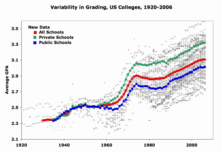
Keep the above red line (tuitions) in mind as you glance at the chart below: grade inflation.
The grades’ line also slopes up.
Sure looks like — as tuitions are rising — colleges are dishing out more high grades.
Cause & effect or just a coincidence?
Hmmm