Interesting chart in today’s WSJ … I’ve added a few highlights.
Basic point raised in the article: The reported drop in the unemployment rate is masking a more fundamental weakness in the job market.
As we’ve harped before, the employment to population ratio is down about 5 pp from the pre-crisis long-term average … and despite a decline in the unemployment rate, the employment to population ratio has stayed flat over the past couple of years.
The culprits keeping the employment to population ratio low:
- bona fide unemployment – too few jobs
- demographics -old folks retiring
- social programs – extended unemployment
- faux disability enrollments
Our prior analyses allocate about 1/3 of the drop to demographics, about 1/2 to lack of jobs and the rest to social programs and disability bumps.
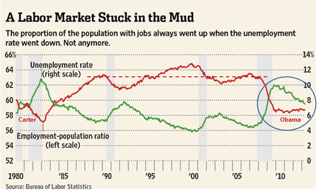
Note from the employment to population chart …
1) The 20 year pre-crisis trend …. hovered around 63%.
2) The steady increase during the 1980’s … you know, the Reagan years … more growth, fewer handouts.
3) The similarity in the levels during the Carter and Obama years … coincidence?
* * * * *
Follow on Twitter @KenHoma >> Latest Posts
Leave a Reply