Couple of charts from Fidelity that depict the state of the economy on the head of a pin.
Well, make that two pins…
* * * * *
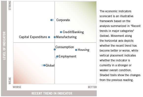
U.S. Economic Indicators Scorecard
On the vertical axis is the current state of the variable … good or bad.
For example, “Corporate” – think corporate earnings – is relatively high.
Employment is relatively low – think, 7.95 unemployment.

On the horizontal axis is the trend of the variable – getting better or getting worse.
For example, housing is low, but the trajectory is good..
Capital expenditures are fair to midling … with a weak trend.
Overall, Fidelity’s view is fairly good.
Draw your own conclusions … for the individual variables and the gestalt.
* * * * *
Position in the Business Cycle
Another Fidelity chart depicts a typical business cycle in stages – recovery, expansion, and contraction … and plots their view of where the U.S. economy is now.
Their POV may surprise you …
