155,285 Deaths-to-Date
1,465 Daily New Deaths (peak 2,824 April 21)
> 7-day average 1,051 (peak 2.229 April 23)
68,569 New Cases
> 7-day average 66,192

=============
Details below…
155,285 Deaths-to-Date
1,465 Daily New Deaths (peak 2,824 April 21)
> 7-day average 1,051 (peak 2.229 April 23)
68,569 New Cases
> 7-day average 66,192
=============
Details below…
In prior post, asserted that near-term, more online education is inevitable … and, in another post, we reported a WSJ study that The Results Are In for Remote Learning: It Didn’t Work.
The headline point of the WSJ study:
Preliminary research suggests students nationwide will return to school in the fall with roughly 70% of learning gains in reading relative to a typical school year, and less than 50% in math.
We concluded:
The playing field changed: Teachers are no longer just “competing” against other teachers and subjects for students’ interest … now, they are directly competing against Fortnite and Tik Tok.
That’s not a fair fight…
A couple of loyal readers asked a reasonable question: “Fortnite? What the heck are you talking about?”
Well…
During the past couple of months, I had a unique opportunity: occasionally kid-sitting a 1st grader and a 5th grader during the Covid school shut-down.
So, I had a glimpse into the effectiveness of their online virtual classes … and, I got to see how they spent their time with schools and sports locked down.

The experience was eye-opening…
How much “dislearning” have children experienced during the schools’ shut down?
=============
In his 2008 bestseller Outliers: The Story of Success, Malcolm Gladwell popularized the notion of an educational “summer slide”.
Referencing a tracking study of Baltimore City Public School students, Gladwell highlighted evidence that students’ standardized test scores in the fall were generally lower than their scores in the prior spring.
His observation: “Between school years, students’ accumulated learning is diminished”.
In other words, there is a statistically significant “forget factor” if learning isn’t reinforced and edged forward with summer enrichment activities (think: summer school, educational camps, field trips, parental tutoring).
The summer slide is most pronounced for poor students who lack summer enrichment opportunities … and for all students in math.
The black line below illustrates the math score drop-off for typical 3rd, 4th and 5th graders. On average, the typical summer slide in math skills is about 2%. That is, students are 2% less proficient in math after their summer vacations.

Source: WSJ
To make matters worse, note the red line on the chart … it illustrates the projected drop-off due to this year’s virus-induced school closings.
It’s estimated that students will be about 5% less proficient in math than they were when the schools closed … the combined effect of lesser learning during the schools’ shut-down period and an extended summer slide (with many schools declaring no mas in early June) .
More specifically…
153,840 Deaths-to-Date
1,520 Daily New Deaths (peak 2,824 April 21)
> 7-day average 1,004 (peak 2.229 April 23)
66,921 New Cases
> 7-day average 66,850

=============
Details below…
So, parents need to ramp-up for home schooling.

Those are pivotal conclusions that I’ve reached based on the following observations & assumptions:
> Some school systems are starting fully online this fall … and, the number seems to be increasing everyday.
> Others schools are mixing a hybrid of in-class and online learning.
> Even schools starting fully in-class will need to provide an online option for students whose parents opt them out of in-class.
> Similarly, even schools starting fully in-class will need to provide an online option for students who catch the coronavirus and are quarantined.
> Some (or many) schools that start in-class may encounter viral outbreaks that force them to reverse course and go fully online.
==============
Bottom line: Near-term, more online education is inevitable… and, longer-term, it may become a permanent component of practically all educational programs.
So the critical question for educators to ask is not whether or not to go online … it is how to quickly develop and launch effective online teaching … and how to incorporate online learning in on-going curriculums.
For parents, the question is not if, but how to provide a nurturing learning environment at home.
Hillary preached that “It Takes a Village”.
But, sometimes you just can’t count on “the village” to raise and educate your kids.
In those instances, it’s nice to have a nuclear family to fall back on …
152,320 Deaths-to-Date
1,245 Daily New Deaths
> 7-day average 964
64,729 New Cases
> 7-day average 66,871

=============
Details below…
The answer is likely to surprise you!
=============
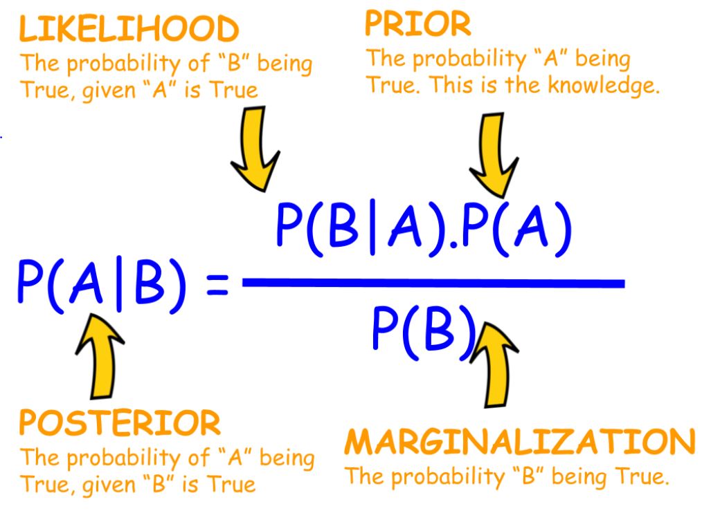
In my strategic business analytics course, I used to teach something called Bayesian Inference … a way to calculate probabilities by combining contextual information (called “base rates” or “priors”) with case-specific observations (think: testing or witnessing).
Today, we’ll apply Bayesian Inference to the COVID testing situation…
150,444 Deaths-to-Date
595 Daily New Deaths
> 7-day average 946
61,571 New Cases Worldometer
> 7-day average 69,186

=============
Details below…
Test results come too late for therapeutic decisions … and “the science” still can’t answer basic questions.
==============
Let’s dig into some numbers today…
Based on some back-of-the envelop arithmetic, I estimate that about 13 million Covid tests have been administered in the 3 weeks ending July 13
Note: The time period is strictly arbitrary. And, since I don’t have all of the daily data series, I just derived rough estimates off the charts. I doubt conclusions would change much with a different time period or more precise numbers

Now, let’s drill down on those numbers….
149,849 Deaths-to-Date Worldometer
451 Daily New Deaths Worldometer
> 7-day average 93&2
56,130 New Cases Worldometer
> 7-day average 68,341

Data Source: Worldometer
=============
Details below…
149,398 Deaths-to-Date Worldometer
906 Daily New Deaths Worldometer
> 7-day average 932
67,413 New Cases Worldometer
> 7-day average 68,648

Data Source: Worldometer
=============
Details below…
149,490 Deaths-to-Date Worldometer
1,193 Daily New Deaths Worldometer
> 7-day average 914
78,009 New Cases Worldometer
> 7-day average 68,054

Data Source: Worldometer
=============
Details below…
In yesterday’s post, I indicated that I was very disappointed with Dr. Brix’s answers in a TV interview with Bret Baer.
One particular question & answer still has me scratching my head:
What is the key statistic that you track?
Birx’s answer: Test positivity (i.e. ratio of positive test results to total tests). It’s the most sensitive indicator and best early warning.
With all due respect, I think that Dr. Birx is confusing “positivity” with “prevalence”.
I’m way more interested in the latter prevalence: the percentage of the population that is currently infected with the virus.
Prevalence indicates how widespread the virus is at any point in time in a selected locale.
That gives me a sense of how safe it is to leave my house: How many people am I likely to run into who have the virus and may be contagious.
=============
Determining prevalence requires periodic random sampling of the population.
That’s not what’s being done now.
A representative sample of the local populations is not being tested.
Why is that a problem?
The positivity rate (Birx’s key metric) is a function of who shows up to be tested.
If only people with covid-like symptoms are being tested, then of course, the positivity rate will be high.
If there’s a groundswell of asymptomatic people, the positivity rate will likely be relatively low.
My hunch: The testing “sample” is skewed to people with symptoms.
In a prior post, we reported that “Asymptomatics” are not rushing to get tested and provided some subjective reasons why that might be (e.g. no doctor referral, high hassle factor, privacy concerns).
So, positivity is, at best, a very crude measure of prevalence.
=============
To that point, keep in mind…
147,297 Deaths-to-Date Worldometer
1,114 Daily New Deaths Worldometer
> 7-day average 882
68,278 New Cases Worldometer
> 7-day average 67,623

Data Source: Worldometer
=============
Details below…
Old paradigms, lack of data, inconclusive.
===============
Yesterday, Bret Baer in-depth interviewed Dr. Deborah Birx.
For the record, I think that Dr. Birx is a trusted source: smart, experienced, knowledgeable, “clued in”, well-intended, apolitical, honest, etc.
I thought that Baer’s questions cut to the chase:
Unfortunately, Dr. Birx’s answers to these pivotal questions were, in my opinion, very disappointing.
146,183 Deaths-to-Date Worldometer
1,239 Daily New Deaths Worldometer
> 7-day average 860
71,907 New Cases Worldometer
> 7-day average 68,353

Data Source: Worldometer
=============
Details below…
A conceptual rationale for why COVID cases are surging but deaths aren’t.
=============
All along I’ve been arguing that the truest and most relevant measure of COVID-fighting is the death rate.
MUST READ: How will we know when we’ve turned the COVID-19 corner?
And, I’ve recently been showcasing the relationship between confirmed cases and deaths.

The data says: Since mid-April, the number of daily confirmed cases has more than doubled, but the number of daily new reported deaths has apparently stabilized at about half of mid-April levels.
How can that be?
Here’s a way of thinking about the how & why…
144,944 Deaths-to-Date Worldometer
1,113 Daily New Deaths Worldometer
> 7-day average 829
66,933 New Cases Worldometer
> 7-day average 68,322

Data Source: Worldometer
=============
Details below… (more…)
We’ve been emphasizing that while the number of confirmed cases has more than doubled since mid-April, daily reported new deaths have arguably stabilized at about half of their mid-April level.

Today, let’s get a bit more granular and drill down to the states’ level… where the data is VERY interesting.
143,825 Deaths-to-Date Worldometer
538 Daily New Deaths Worldometer
> 7-day average 797
62,656 New Cases Worldometer
> 7-day average 68,130

Data Source: Worldometer
=============
For details, keep reading… (more…)
A potentially big first step to efficient testing
=============

Over the weekend, the FDA issued an emergency use authorization for pooled samples.
The Quest test is the first COVID-19 diagnostic test to be authorized for use with pooled samples.
Her are details from the FDA press release:

Data Source: Worldometer
=============
Cumulative Deaths
143,289 Worldometer
===============
412 Daily New Deaths Worldometer
> 7-day average 786

==============
Currently Hospitalized
> 57,000 July 17
> 7-day average 57,000
> April 22 peak 59,000
> June 21 low point 28,000
===============
Confirmed Cases
> 65,279 New Cases Worldometer
> 7-day average 68,535
> Highest day 73,388 July 16
> April 24 peak 36,291
> June 8 low point 17,414

Data Source: Worldometer
=============
Cumulative Deaths
142,877 Worldometer
===============
783 Daily New Deaths Worldometer
> 7-day average 782

==============
Currently Hospitalized
> 58,000 July 17
> 7-day average 55,000
> April 22 peak 59,000
> June 21 low point 28,000
===============
Confirmed Cases
> 63,259 New Cases Worldometer
> 7-day average 67,345
> Highest day 73,388 July 16
> April 24 peak 36,291
> June 8 low point 17,414
No question, the number of confirmed coronavirus cases has skyrocketed since mid-June.
During the same time period, daily new deaths reported have leveled off … typically ranging between 500 and 1,000.
The chart below displays the 7-day moving average of daily reported new cases and deaths … indexed to their levels in mid-April when daily new deaths previously peaked (2,824 on April 21) and daily new cases were running about 30,000.
![image_thumb[18]](https://homafiles.info/wp-content/uploads/2020/07/image_thumb18.png "image_thumb[18]")
Data Source: Worldometer
My take:
Even factoring a lag time between case diagnoses and deaths, it doesn’t appear that the higher case counts are driving a commensurate spike in deaths.
Cumulative Deaths
142,054 Worldometer

===============
939 Daily New Deaths Worldometer
> 7-day average 758

==============
Currently Hospitalized
> 57,000 July 16
> 7-day average 54,000
> April 22 peak 59,000
> June 21 low point 28,000
===============
Confirmed Cases
> 74,987 New Cases Worldometer
> 7-day average 67,325
> Highest day 73,388 July 16
> April 24 peak 36,291
> June 8 low point 17,414
Some reasons to be optimistic
=============
WaPo ran an op-ed by Joseph Allen — a Harvard prof specializing in “exposure assessment science”.
Prof. Allen offers up 6 “positive developments to remind us that there is hope in this crisis”.

Here’s Prof Allen’s list:
1. Therapeutic treatments
in addition to what we already have for most sick patients, more targeted therapeutic treatments will arrive — probably before vaccines.
Scientists have now engineered synthetic clones of coronavirus antibodies — called monoclonal antibodies — and they are showing to be effective both therapeutically and to prevent infection.
Cumulative Deaths
141,125 Worldometer

===============
965 Daily New Deaths Worldometer
> 7-day average 758

==============
Currently Hospitalized
> 57,000 Current
> 7-day average 54,000
> April 22 peak 59,000
> June 21 low point 28,000
===============
Confirmed Cases
> 73,388 New Cases Worldometer
> 7-day average 66,868
> Highest day 73,388 July 16
> April 24 peak 36,291
> June 8 low point 17,414
The liberal media has been downright giddy this week, trumpeting an AP headline:

The source of the gidddyness: An uptick in the number of daily new reported deaths … the 7-day average of daily new deaths troughed at 517 on July 6 … since then, the 7-day M.A. has increased to 757 … or, as the press likes to say: “increased a catastrophic 50%”

Those are the numbers … and, the only conclusion that can be drawn is that the huge spike in sun belt cases is finally working it’s way through the system … catapulting the death rate upward. Right?
Well, maybe.
But let’s add some perspective to the numbers…
Cumulative Deaths
140,160 Worldometer
===============
1,017 Daily New Deaths Worldometer
> 7-day average 757

==============
Currently Hospitalized
> 56,000 Current
> 7-day average 52,000
> April 22 peak 59,000
> June 21 low point 28,000
===============
Confirmed Cases
> 71,750 New Cases Worldometer
> 7-day average 63,693
> Highest day 71,750 July 15
> April 24 peak 36,291
> June 8 low point 17,414
Test results come too late for therapeutic decisions … and “the science” still can’t answer basic questions.
==============
Based on some back-of-the envelop arithmetic, I estimate that about 13 million Covid tests have been administered in the 3 weeks ending July 13
Note: The time period is strictly arbitrary. And, since I don’t have all of the daily data series, I just derived rough estimates off the charts. I doubt conclusions would change much with a different time period or more precise numbers
Now, let’s drill down on those numbers….
=================
Of the roughly 13 million tests that were reported, over 12 million (94%) came back covid-negative’.
Note: Practically all headline reporting is “confirmed cases” — the test results that were covid-positive. Total test minus positive results estimates negative results.

My 1st question is who the heck are these 12 million people who are testing negative … and why, in the first place, are they even being covid-tested.
Some possibilities:
I think the top 5 categories are pretty legit.
The last 2 strike me as a waste of constrained testing capacity.
Regardless, wouldn’t it be nice to know how the 12 million sorts out by those categories?
Apparently, that sort of classification data isn’t captured at the point-of-testing … or, public health officials just aren’t making the data available.
That’s too bad
===============
Moving on…
Less than 1 million of the 13 million tested Covid-positive … a “positivity rate” of 6%.
Who are these people and how are they treated when they’re tagged as infected?
I’d like to know:
Again, it appears that this sort of classification data isn’t captured at the point-of-testing … or, public health officials just aren’t making the data available.
============
Bottom line: We need to focus constrained testing resources on therapeutic decision incidences … and, we need to gather and analyze more classification so that the testing helps pin down how this virus is acting.
Testing that simply increases the number of tests doesn’t seem to be getting us anywhere.
“The paper of record is, more and more, the record of those living in a distant galaxy”
=============
Bari Weiss, a high-profile editor and writer for the New York Times opinion section, resigned Monday, citing what she said was unchecked bullying from colleagues and depicting the news organization as a place where the free exchange of ideas was no longer welcome. Source
Ms. Weiss bills herself as a non-ideological centrist. A position that seems to be borne out in media reactions to her resignation.
Liberal media sentiment: “Good riddance”; Conservative media: “Nice try, Dani”.
What’s noteworthy is the scathing resignation letter that Ms. Weiss wrote and published online.
Here are some snippets….
Cumulative Deaths
139,143 Worldometer
===============
895 Daily New Deaths Worldometer
> 7-day average 739

==============
Currently Hospitalized
> 54,000 Current
> 7-day average 48,000
> April 22 peak 59,000
> June 21 low point 28,000
===============
Confirmed Cases
> 65,594 New Cases Worldometer
> 7-day average 63,693
> Highest day 68,000 July 10
> April 24 peak 36,291
> June 8 low point 17,414
Avoid them to improve your odds of staying COVID-free (and alive)
=============
A consensus seems to be emerging among researchers that the bulk of coronavirus infections happen in “clusters” and can be traced to a small number of “super-spreading” people, events, venues and activities.
The obvious conclusion: avoid them to minimize the chance that you get infected.
In a prior post we explained why super-spreader people are so difficult to identify … and offered 2 principles: (1) Consider everybody that you run into as being a GUPI (Guilty Until Proven Innocent), and (2) avoid high risk activities and places where GUPIs hang out.
Let’s get practical on those principles…
Cumulative Deaths
138,753 Worldometer
===============
460 Daily New Deaths Worldometer
> 7-day average 753

==============
Currently Hospitalized
> 54,000 Current
> 7-day average 48,000
> April 22 peak 59,000
> June 21 low point 28,000
===============
Confirmed Cases
> 65,488 New Cases Worldometer
> 7-day average 62,243
> April 24 peak 36,291
> June 8 low point 17,414
Avoid them to improve your odds of staying COVID-free (and alive)
=============
A consensus seems to be emerging among researchers that the bulk of coronavirus infections happen in “clusters” and can be traced to a small number of “super-spreading” people, events, venues and activities.
The obvious conclusion: Avoid them to minimize the chance that you get infected.

Today, let’s drill down on the people who may be super-spreaders…
Cumulative Deaths
137,746 Worldometer
===============
382 Daily New Deaths Worldometer
> 7-day average 746

==============
Currently Hospitalized
> 53,000 Current
> 7-day average 46,000
> April 22 peak 59,000
> June 21 low point 28,000
===============
Confirmed Cases
> 58,349 New Cases Worldometer
> 7-day average 60,114
> April 24 peak 36,291
> June 8 low point 17,414
Cumulative Deaths
137,405 Worldometer
===============
734 Daily New Deaths Worldometer
> 7-day average 727

==============
Currently Hospitalized
> 52,000 Current
> 7-day average 44,000
> April 22 peak 59,000
> June 21 low point 28,000
===============
Confirmed Cases
> 61719 New Cases Worldometer
> 7-day average 57,960
> April 24 peak 36,291
> June 8 low point 17,414
Cumulative Deaths
136,671 Worldometer
===============
849 Daily New Deaths Worldometer
> 7-day average 653

==============
Currently Hospitalized
> 52,000 Current
> 7-day average 42,000
> April 22 peak 59,000
> June 21 low point 28,000
===============
Confirmed Cases
> 71787 New Cases Worldometer
> 7-day average 55,597
> April 24 peak 36,291
> June 8 low point 17,414
It’s hard to follow “the science” when it’s inconclusive.
=============
It appears that most school systems are on a path to open their schools either fully or partially (e.g. rotating students every other day or every other week) … and, to mitigate the risks by capacity limiting busses, socially distancing students in classrooms, wearing masks, etc.

In a couple of weeks, many parents will be forced to make a very big decision: Do they send their K-12 children back to school or not?
Classical public health thinking would say to focus on four questions:
1. Are kids susceptible to the coronavirus?
2. If yes, will mitigation actions sufficiently reduce the risk?
3. Are infected kids vulnerable to severe outcomes?
4. Do infected kids transmit the virus to others?
Unfortunately, “the science and the data” don’t provide much guidance…
=============
During this week’s White House briefing on school reopening…
Sally Goza – President of the American Academy of Pediatrics said:
Children are less likely to become infected and they are less likely to spread infection.
But, White House health advisor Dr. Deborah Birx countered that there’s not enough data to arrive at that conclusion:
The U.S. data is incomplete, because the country has not been testing enough children to conclude how widespread the virus is among people younger than 18 and whether they are spreading the virus to others.
If you look across all of the tests that we’ve done, and when we have the age, the portion that has been the lowest tested portion is the under-10-year-olds.
Our data is skewed to people with symptoms, and then skewed to adults over 18.”
Bottom line: “The science” doesn’t know whether kids are susceptible to the coronavirus or not.
The mitigation actions are likely to reduce contagions risks, but it’s unrealistic to expect that they will eliminate the risks.
=============
Perhaps the best news so far is that there have been practically no coronavirus deaths among children.
A lot of people are hanging their hats on the apparently low fatality rate as an indicator that severe outcomes are unlikely.
But, keep in mind that kids have been sheltered-in-place since schools closed in the spring, so they have been minimally exposed to the virus.
Some health “experts” warn that’s a double-edged sword since kids haven’t had a chance to develop immunities that counter the coronavirus.
So, when schools open, the proverbial dam may break.
=============
That gets us back to whether or not infected kids are likely to transmit the virus to others.
This is, in my opinion, the pivotal decision factor.
Again, the evidence is, at best, equivocal.
“While some scientists fear schools could act as accelerators for the pandemic, no country where schools have reopened has so far reported a sharp increase in infections.” WSJ
That said, I side with Dr. Birx that “there’s not enough data to conclude whether kids are spreading the virus to others.”
So, I’d apply a variant of Pascal’s Wager to the transmission question.
See HITS: Pascal’s Wager … perhaps, we should be more righteous.
That is, assume that kids are susceptible to the virus, that mitigation actions will reduce but not eliminate contagion, and that infected kids do transmit the virus.
Then, the critical question is:
Are there vulnerable people potentially exposed to infected kids?
If there are vulnerable caretakers at home (e.g. are elderly or suffer co-mobidity factors) … or anyone with compromised or underdeveloped immune systems (e.g. chemo patients or newborns) … then Pascal’s Wager kicks in.
In those cases, the risks of going back to school increase substantially, maybe reversing the decision calculus.
It may be less about whether the kids will suffer bad outcomes … and more about who the kids might infect — and what the consequences will be on them.
Hmmm…
Cumulative Deaths
135,822 Worldometer
===============
960 Daily New Deaths Worldometer
> 7-day average 621

==============
Currently Hospitalized
> 44,000 Current
> 7-day average 40,000
> April 22 peak 59,000
> June 21 low point 28,000
===============
Confirmed Cases
> 61,067 New Cases Worldometer
> 7-day average 53,186
> April 24 peak 36,291
> June 8 low point 17,414
In-person? Online? Hybrid? … What to do?
=============
My view: Educators (especially at the college level) are making a fundamental mistake when trying to structure their curriculums for the fall.
They’re thinking about the problem in the wrong way.

Now, most schools are simply trying to maintain past schedules and coax all courses online, essentially emulating what’s currently being done in the classroom.
Rather, they should strategize around two fundamental questions:
1. Which courses require classroom presence?
2. Which courses are most suitable for online delivery?
When those questions are answered, load the fall schedule with the most online-suitable courses … and defer the classroom-dependent courses until the virus is behind us (hopefully when the calendar flips to 2021)
=============
So, which courses are classroom-dependent and which are online-suitable?
Cumulative Deaths
134,862 Worldometer
===============
892 Daily New Deaths Worldometer
> 7-day average 582

==============
Currently Hospitalized
> 43,000 Current
> 7-day average 40,000
> April 22 peak 59,000
> June 21 low point 28,000
===============
Confirmed Cases
> 64,848 New Cases Worldometer
> 7-day average 82,896
> April 24 peak 36,291
> June 8 low point 17,414
Tip of the hat to Georgetown on this one.
=============
Last week, I did some reading re: the Herculean challenges facing colleges as they contemplate when and how to re-open.

In a nutshell, residence colleges face three major challenges:
One aspect of healthy campuses is instituting a comprehensive Covid testing program.
Many schools are rationalizing away the need for testing, arguing that tests aren’t sufficiently accurate and that they cost too much to administer. Source
That’s not the approach that Georgetown is taking…
Expanded Data Set:
Cases > Hospitalizations > Deaths
=============
Cumulative Deaths
133,972 Worldometer
===============
663 Daily New Deaths Worldometer
> 7-day average 552

==============
Currently Hospitalized
> 41,575 Current
> 7-day average 38,000
> April 22 peak 59,000
> June 21 low point 28,000
===============
Confirmed Cases
> 55,442 New Cases Worldometer
> 7-day average 50,156
> April 24 peak 36,291
> June 8 low point 17,414
New peer-reviewed study finds hydroxychloroquine’s life-saving benefits.
===============

The results of a large-scale analysis, conducted by the prestigious Henry Ford Health System, was published last week in the peer-reviewed International Journal of Infectious Diseases.
The study examined 2,541 patients who had been hospitalized in six Henry Ford hospitals between March 10 and May 2, 2020.
More than 90% of the patients receiving hydroxychloroquine were treated with the drug within 48 hours of admission to the hospital.
The study’s fundamental finding:
26.4% of patients who did not receive hydroxychloroquine died.
But among those who received hydroxychloroquine, fewer than half that number — 13% — died.
The difference in mortality is, by all measures, statistically significant.
How can that be?
414 Daily New Deaths Worldometer
> 7-day average 517

States reporting more than 25 New Deaths:
CA 76, TX 63, FL 46
===============
Cumulative Deaths
132,979 Worldometer
===============
Confirmed Cases
> 50,586 New Cases Worldometer
> 7-day average 48,172
> April 24 peak 36,291
> June 8 low point 17,414
Channeled from the Visual Capitalist…
Just in case your 4th of July weekend was too celebratory, welcome back to reality.
The World Economic Forum surveyed 347 risk analysts on how they rank the likelihood of major risks we face in the aftermath of the pandemic.
In the survey, a “risk” is defined as an uncertain event or condition with the potential for significant negative impacts on various countries and industries.
These were the 10 risks considered most likely to occur:
click to enlarge image

The risk analysts were also asked which of these risks they considered to be of the greatest concern for the world.
Here’s what they said…
263 Daily New Deaths Worldometer
> 7-day average 591

States reporting more than 20 New Deaths:
NY 33, FL 29, TX 27, NJ 22
===============
Cumulative Deaths
132,571 Worldometer
===============
Confirmed Cases
> 44.530 New Cases Worldometer
> 7-day average 46,675
> April 24 peak 36,291
> June 8 low point 17,414
Take a moment to remember how lucky we are …

688 Daily New Deaths Worldometer
> 7-day average 643

============
Cumulative Deaths
132,101 Worldometer
Confirmed Cases
> 54,904 New Cases
> 7-day average 46,409


